Written Branding
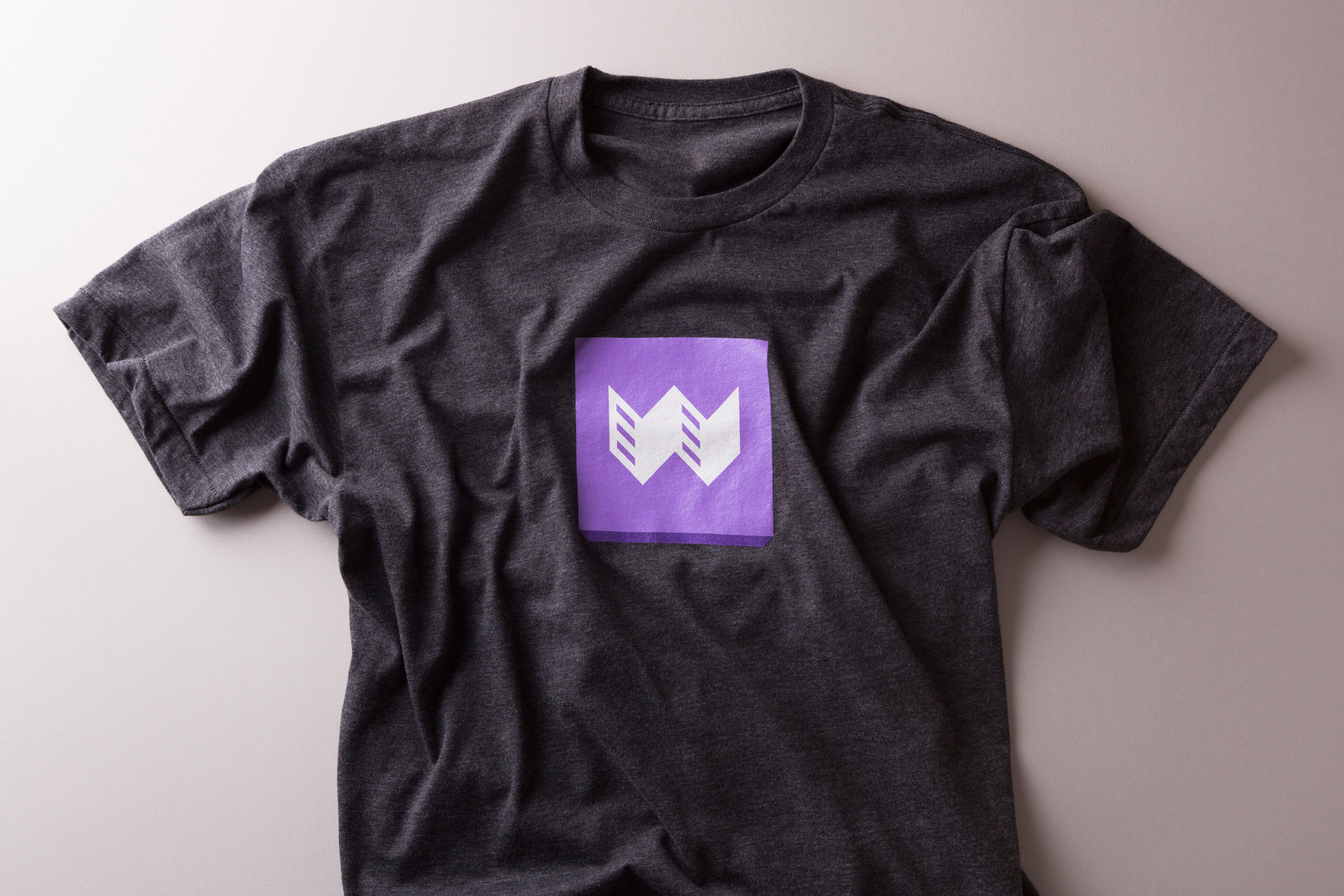
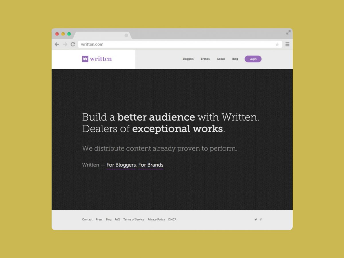
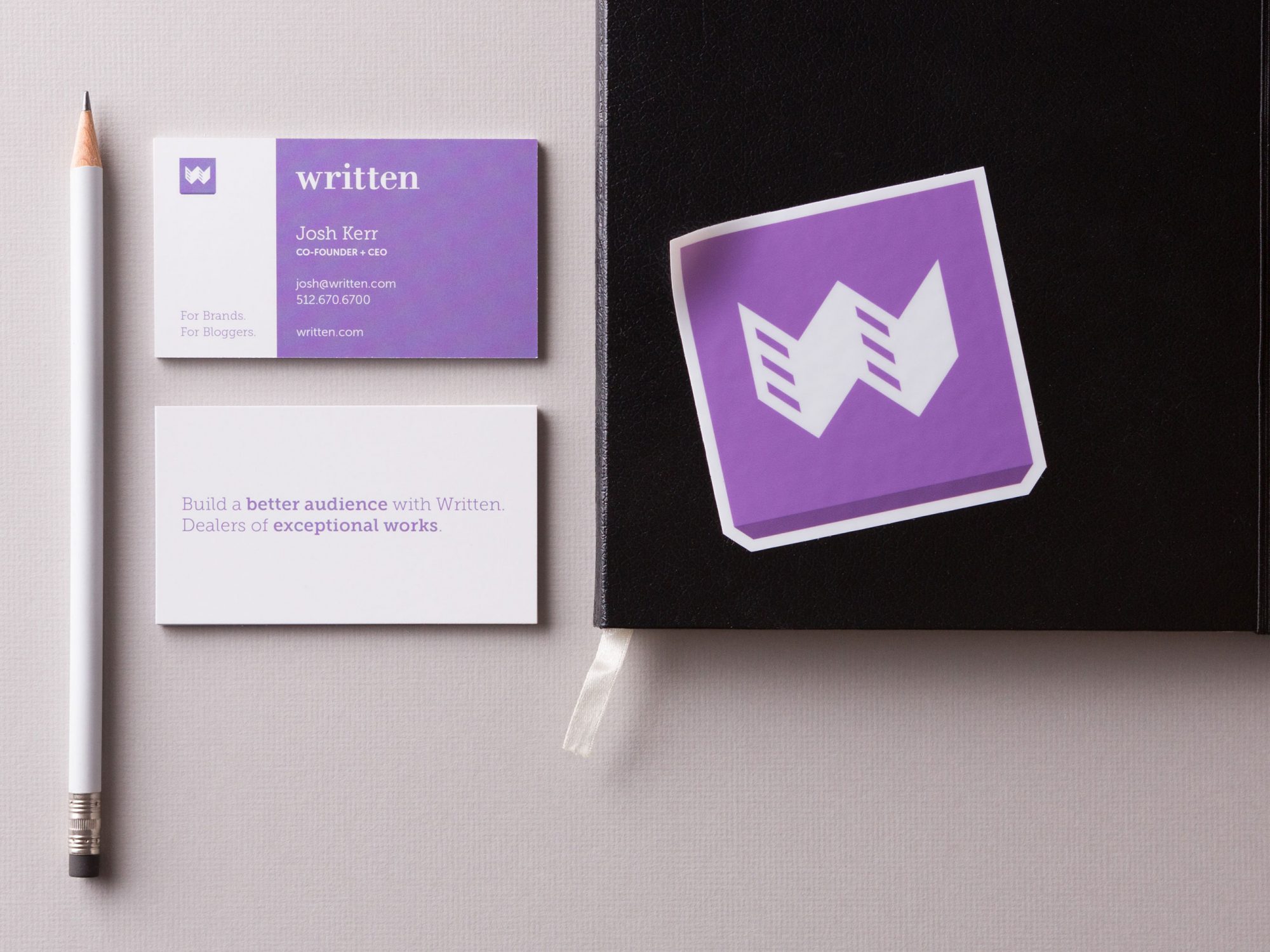
Written came to Heavy Heavy in need of a new identity to better reflect their sensibilities as a company, their commitment to the brands they work with, as well as the bloggers they find licensing deals for. During production a basic geometric foundation was used to cultivate Written’s final mark. This was paired with an edited Bodoni typeset, separating Written’s identity from the herd.
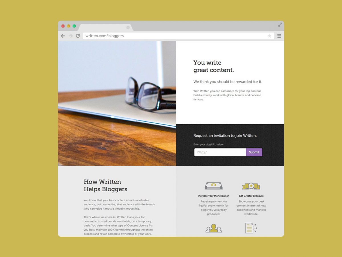
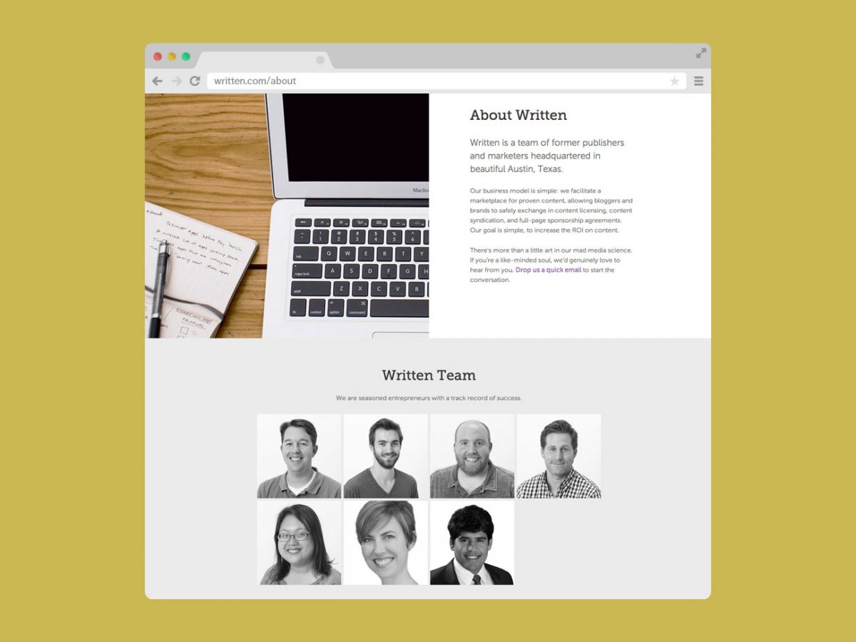
At the core of Written’s service is delivering meaningful content to the right audience and we knew typography would be an important part of that, leading us to the Museo Sans and Museo Slab font families. Our main goal for the marketing website was to declutter the interface and clearly define actionable items for both targeted audiences. Heavy Heavy designed pages that are extensible and modular, allowing Written to expand and contract future content as the team saw fit.