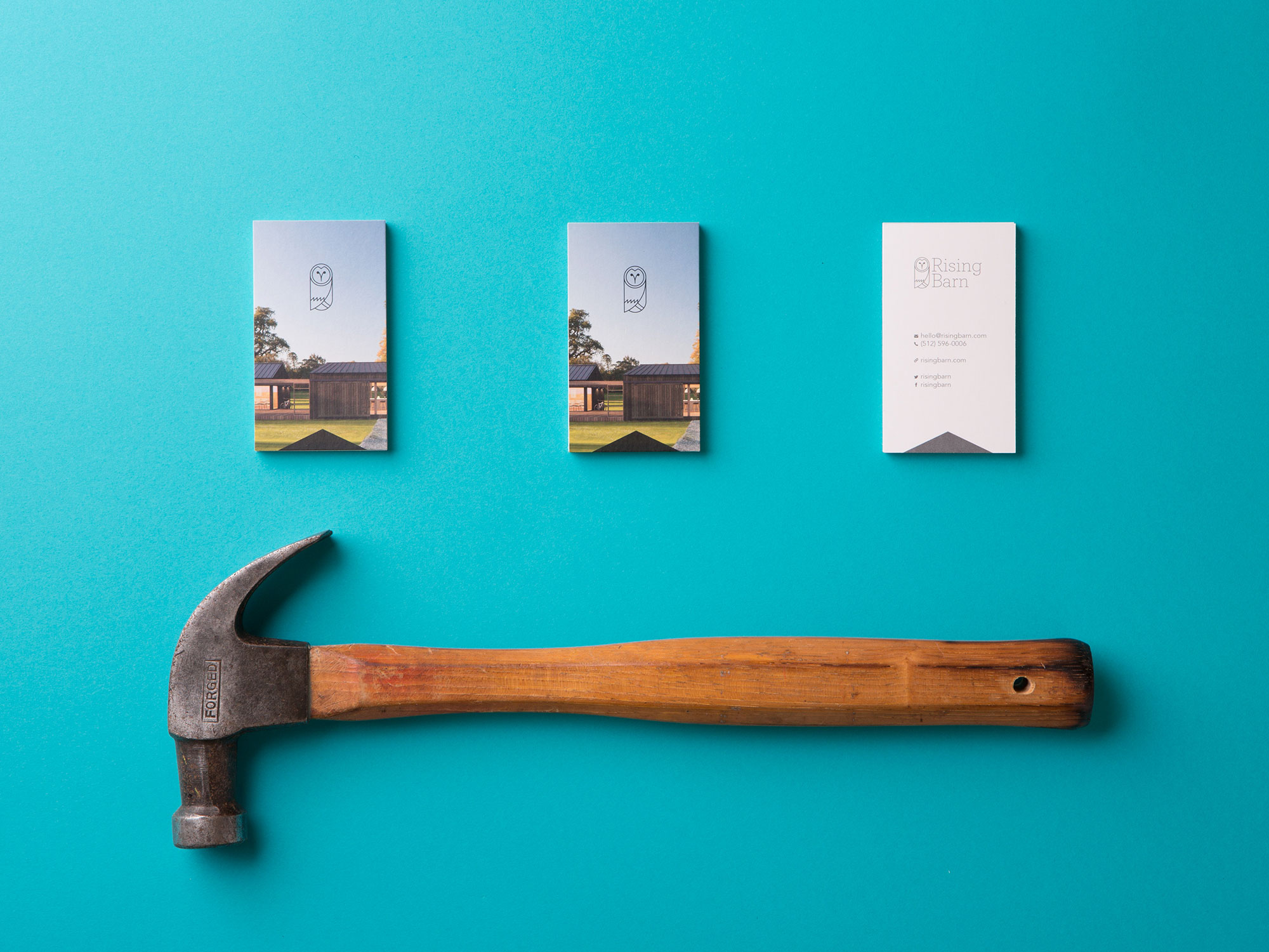
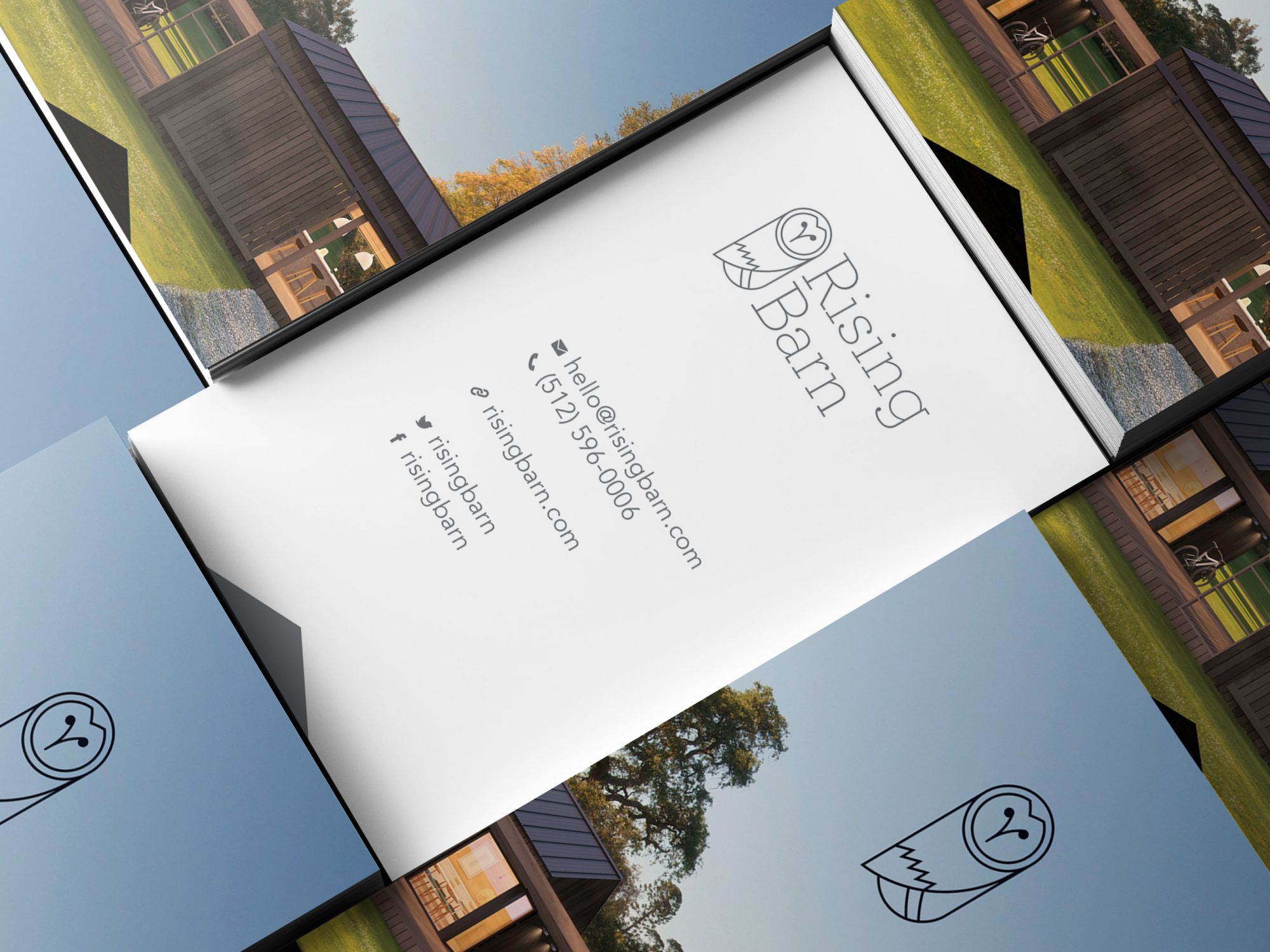
Rising Barn Rebrand
As a new startup Rising Barn needed a visual identity to establish the brand within the identified core demographic. Micro-living appeals to a growing number of market segments that include young urbanites and retirees alike. With a large target market, and no brick-and-mortar storefront, Rising Barn’s mark had to solidly build trust in the brand.
Heavy Heavy needed to communicate the trust and comfort associated with a home and the barn owl was an elegant way to communicate this. Designed with a sense of math, the icon balances simplicity and function. It’s fun, flexible, works well with type, and easily stands alone as an abbreviated mark. Tailored to custom home builders and Do-It-Yourselfers, the mark speaks directly to their sense of lifestyle—simple, reliable, and sustainable.